
Congratulations to the 2025 Coffee Design Award Winners!
The 2025 Coffee Design Awards celebrate outstanding creativity and innovation across branding, packaging, and spaces. This competition recognizes the thought, craft, and storytelling that shape how we experience coffee. Thank you to all of the 2025 entrants that submitted to the awards.
Branding: Recognizes the brands, identities, and visual environments that companies in coffee use to stand out.
Packaging: Celebrates innovative coffee packaging designs that go beyond traditional brand standards.
Spaces: Honors thoughtfully designed places for brewing, teaching, and serving coffee.

“We are proud to recognize these outstanding products that reflect our industry's passion, creativity, and forward-thinking spirit,” said Yannis Apostolopoulos, CEO of the Specialty Coffee Association. “This year’s winners are truly setting new standards in specialty coffee and inspiring the entire coffee community.”
Winner: Puelo Coffee Roasters
Award Category: Spaces
Location: Santiago de Chile
Designers: Estudio Cenit / Cristobal Fell
Company Website: puelocafe.cl
Connect on Social: instagram.com/puelocoffeeroasters


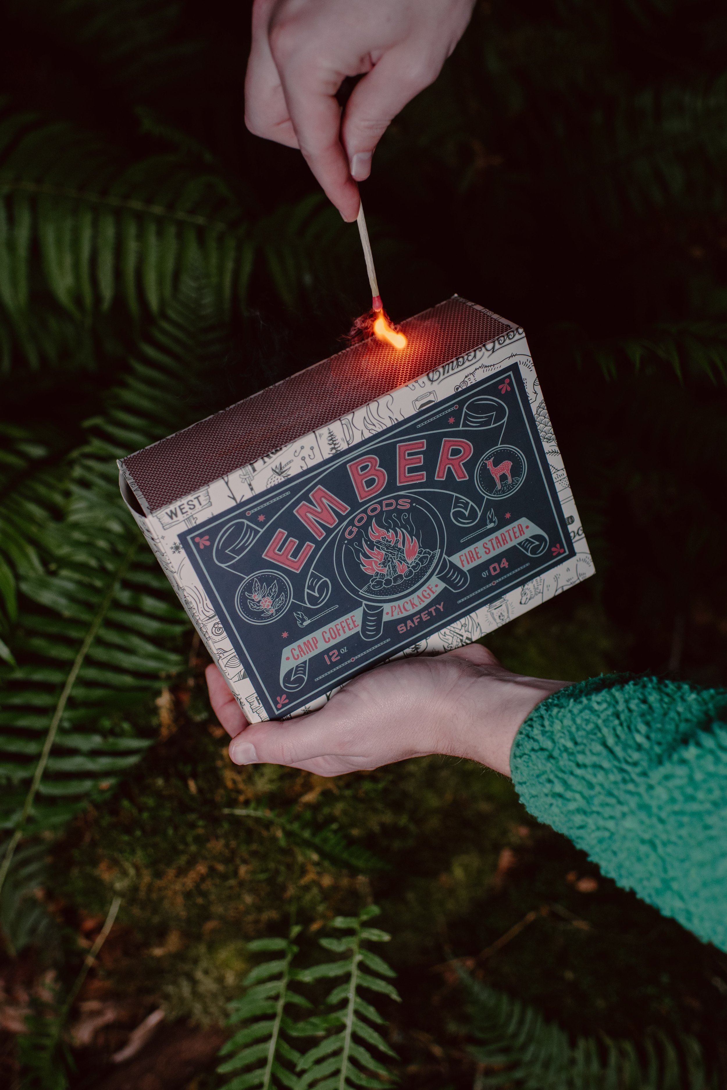
Winner: Ember Goods
Packaging Proudly Supported by:

Award Category: Packaging
Location: Olympia, Washington
Designers: Logan Smith, Zachary Kiernan
Company Website: embergoods.com
Connect on Social:


Winner: Yettu: Earth to Cup
Category: Branding
Location: Tamil Nadu, India
Designers: Tekwani Design Co.
Company Website: tekwanidesign.com
Social Media: @tekwanidesign


Learn More About the Winning Projects
-
About the Project:
The colors and materials represent the atmosphere of a cozy and elegant place where customers can realize how we treat coffee as a true nutrient. We make our best effort to show the best expression of the process to create a cultural impact in our society and the coffee industry in our neighborhood and in Chile, because people don't even realize that coffee is a red fruit whose seed is green. By being fully transparent with every process, we give people trust that they are getting the best coffee in town and help them understand what Specialty Coffee truly is.Regarding our packaging, it represents the palette of colors of our iconic bird, the Martin Pescador, and its environment, living in the native forest of a river called Puelo in Patagonia. That’s why we also incorporate wood in the entrance and tables of our roastery, reused from demolitions. The stainless steel represents how clean we should be, reflecting how professionally we are treating the coffee as it deserves.
At the end, the challenge was to connect the atmosphere of Patagonia with a premium workshop environment, making people understand that as they love food, now they will love our specialty coffee.
The iron screen of the roastery and the back bar of the coffee shop are fully connected with the packaging design, creating harmony and combining an industrial and modern view with our elegant place.
Design Concept, Inspiration, and Philosophy:
Slow Roasting (Our Philosophy). At Puelo, we take the necessary time to do things well. Just like our dear Río Puelo, we work without haste, with passion and dedication, following the philosophy of coffee, paying attention to every step of the journey from grain to cup. Enjoy your moment with a rich, specialty coffee.GRANOS SIN APUROS / GRAIN WITHOUT RUSH (Our Claim and Meaning). Without a doubt, we live in a fast-paced world that demands us to multitask constantly. The dizzying rhythm of everyday life pressures us to run in a world that needs to walk more.
Quite the opposite of city life, in our essence, we believe happiness is found in the enjoyment of everyday life, in the simplicity of our daily activities, and in our ability to stop and put our energy and attention into the present moment. (This also connects with our philosophy of Slow Roasting.)
Sustainability:
It was a real challenge to open our roastery. It is the first electric roastery in a residential neighborhood in South America. We are located in Vitacura, one of the most environmentally demanding city halls.
It was our commitment and tenacity to do things well to create the impact we were looking for.
The real message is our focus on our customers, who can feel how much effort we put into creating an environment that combines fresh food, sustainable construction materials, and the open roastery experience.All our packaging is made with Biotre compostable material. This way, we create an atmosphere that represents our natural values of responsibility and commitment throughout the entire value chain.
Final Comments:
In 2019, before we opened Puelo Coffee Roasters, we opened Puelo Café (Specialty Coffee). Puelo Café was born from the concept of creating a neighborhood specialty coffee shop with ecological and sustainable values, inspired by the Puelo River, aiming to reflect a southern, welcoming atmosphere with organic, fresh, and top-quality products.That’s how everything started. Becoming experts in service and evolving within the specialty coffee movement, in 2023 we decided to start the project of our own roastery, traveling to the Portland SCA, aiming to become one of the greatest exponents of the specialty industry locally, giving greater value to our brand while maintaining our seal of quality products and service.
That’s how we connected with the main stakeholders and are now part of the beginning of what we believe is going to be something big, because our purpose is to create sustainable business focused on the value chain and customers.
-
About:
We wanted to invoke the feeling of being outdoors with friends and family and gathering around the fire with a great cup of coffee in hand. The hope is that this is everything you need to start a fire and, most importantly, have some delicious coffee. Our main reference was a vintage matchbox and playing on the name of our company, Ember Goods. We believe that any good idea or conversation starts with an "Ember" before it turns into a fire.About the Materials, Form, and/or Color:
This is a custom box that will hold a bag of coffee and a smaller box that has a fire starter made from our used coffee grounds. This is something that ties into the Pacific Northwest area as well as the name of our company, Ember Goods. The entire feel for the box is to make it seem like a giant vintage matchbox. The materials used are thick paper/cardboard for the boxes and an eco-friendly bag for the coffee. We also use wood shavings for the stuffing in the box (which can also be used as a fire starter when you are out camping!). The colors all match with our current branding and are earth tones that again tie into the PNW.Design Concept, Inspiration, and Philosophy:
I noted a bit on that in the last segment, but this is something that is inspired by our company name as well as the region that we live in. We are an outdoor-focused specialty coffee shop, so the idea behind it is to bring it out camping with you where you can start your fire with all of the materials and make your perfect cup of coffee!On the Topic of Sustainability:
The materials used to make the fire starter are recycled coffee grounds. We are also donating 10% of all proceeds to wildfire relief to hopefully combat more natural disasters in our area and around the world.Final Comments:
The fire starter in the box also comes with some wooden matches, and there is a "strike strip" on the outside of the box so you have all that you need to start a fire to make some coffee! The entire design hopefully invokes childhood memories of going camping with your family or friends and having a matchbox to start a warm fire to gather around. Our mission statement is "Everyone is Welcome Here." and "Drink good coffee, do good things." -
About the Project:
Yettu is a green coffee exporter specializing in high-quality Indian coffee, carefully sourced from the fertile lands of Tamil Nadu. Rooted in the Tamil word for "eight," symbolizing transcendence and wisdom, Yettu embodies a journey from earth to cup, honoring ancient farming traditions and sustainable practices. Supplying green coffee to Japan for roasting, Yettu bridges India’s rich coffee heritage with a discerning international market. Inspired by handmade coffee farming tools and architectural elements, the custom-designed logotype reflects the brand’s authenticity and cultural depth. The Yettu mark, influenced by the Usgalimal Petroglyphs, visually represents interconnected roots and growth, reinforcing the brand’s commitment to storytelling and craftsmanship. Our work helped shape this identity, ensuring that Yettu’s brand is as rich and layered as the coffee itself, seamlessly blending heritage, sustainability, and design.Choice of Materials, Form, and/or Color:
The use of Rani pink and other earth tones, along with patterns inspired by traditional Indian art, creates a compelling blend of ancient and modern influences. Papers used for letterhead as well as future packaging concepts will be made of recyclable papers and soy-based inks.Design’s Concept, Inspiration, and/or Philosophy:
The Yettu logotype was custom-designed to bridge Indian coffee culture with a Japanese audience. It embodies the brand’s “Earth to Cup” philosophy, reflecting the journey of coffee from cultivation to consumption. The letterforms feature custom lettering inspired by handmade coffee farming tools and architectural elements from the Tamil Nadu region of India, creating a distinct and meaningful visual identity. This handcrafted typography reinforces Yettu’s commitment to authenticity and tradition while maintaining a modern appeal.Complementing the logotype, the design incorporates patterns inspired by traditional Indian art. The Yettu logo mark draws from the ancient Usgalimal Petroglyphs near Goa, carvings believed to be 20,000–30,000 years old and attributed to the Kush tribe. The labyrinth-like shape, when duplicated and inverted, forms an 8 symbolizing Yettu’s meaning while also resembling a tree with roots. This visually represents the brand’s dedication to sustainability.
This fusion of historical and cultural elements results in a compelling blend of ancient and modern influences, making the design both visually striking and deeply meaningful.
On the Topic of Sustainability:
The “earth to cup” philosophy encapsulates Yettu’s commitment to sustainability, ensuring that every stage of coffee production—from cultivation to processing—follows environmentally responsible practices. The materials used throughout all tangible touchpoints of the brand are and will continue to be environmentally friendly as well.